Creating a timeless brand identity in an industry that’s only just getting started
Case Study
Ryan Taylor & Elliot Anderson
We first met Scott Millward — founder and owner of Voir — back in the summer of 2021. Barely a year ago, but my god, does time feel so malleable right now.
His story is quite remarkable. At the tender age of twenty-now-you're-just-making-me-feel-old, Scott has already founded a fashion brand, worked for some top firms as their marketing lead, and has now founded a personal branding agency, to meet the rising demand of matching businesses with their customers in ever more online ways.
Scott is an interesting fellow. He’s a contemplator. He’s quietly confident. And, he doesn’t shout and scream and dance around like many marketers. In fact, he’s the antithesis of what you’d expect from a guy with so much experience in the industry.
Longtime followers of Umlaut will know we’re all about the left field. So, that folks, is why we couldn’t wait to work with him. We wanted to know more about Scott and how we could support translating his ideas into a brand that would elevate his company beyond the generic marketing agencies we all (love to) hate.
Creating a brand strategy for an entirely new industry
Unless you’ve been hiding under a rock for the last 5 years, you’ll know that LinkedIn is pretty big. Like massive. And, much like what happened to Instagram when the normals found out about that, it has become littered with guff. We haven’t quite got to the ‘don’t forget to like and subscribe’ era yet, but we aren’t far off.
So, when Scott came to us with an idea to set up a personal branding agency—one that coaches business leaders to navigate this quagmire to reach new clients in an authentic and considered way—we saw an opportunity to look at this industry a little differently.
The return on investment is there for the taking, and given its newness, agencies like Voir are here to help make us sense of it all.
You see, ‘personal branding’ is a misnomer at best and outright asinine at worst. Much like ‘graphic designer’, it’s totally meaningless. Part sales, part marketing, part branding, the basic idea behind personal branding is that you consciously share yourself with the world in the hope of creating and influencing public perception of you and your business.
Generally conducted via social media platforms such as LinkedIn, it’s conducted in a way that demonstrates authenticity, values, and what makes you and your business tick.
The return on investment is there for the taking, and given its newness, agencies like Voir are here to help make us sense of it all.
But, as with anything related to social media, it’s already attracting varying levels of quality, starting with those like Scott that care deeply about this stuff, to ever-increasing levels of pretenders and charlatans. In many ways, the industry is a victim of its success.
To that end, whatever brand strategy we created, needed to demonstrate Voir’s integrity and professionalism above all else. We couldn’t wait to meet the challenge.
Elevating your brand above the wannabes and the hangers on
Ultimately, Scott wanted to differentiate Voir, to move it above the miasma of newbies who have had one viral post and now think they know all there is to know about social media. He couldn’t lean on the tropes of traditional marketing agencies either, with their used car salesman patter and wildly inflated sense of self; that just isn’t what the world responds to any more.
As we’ve said already, Scott isn’t either of those things. He has a vision and a passion for what he does. He can also back up his claims with real-world successes.
‘I love the thing I do, I just hate the way it’s done.’
And that, right from the beginning, was the key to solving this problem. We knew that the best way to attract high calibre clients would be to lean heavily into attributes and values.
Some would think this is an insurmountable task, that we’re swimming against the tide, but the clients we work with regularly have this exact feeling about their industry, indeed we think the same about our own. In a nutshell: ‘I love the thing I do, I just hate the way it’s done.’
Voir couldn’t be more up our alley if it tried.
A user-centred brand identity for a people-focused business
We took an early decision in developing Voir’s brand strategy to downplay the numbers and the memes, the bravado and the bullshit, and instead focus on the values and the user experience. This industry is supposedly about helping others find their voice, so it felt disingenuous to create a brand that navel-gazed.
We also wanted to bring to the fore the bespoke methodology that Scott uses with each of his clients. Scott’s belief is that personal branding is a longterm commitment to a potentially everlasting solution, not a quick fix. With Voir, you learn how to do this thing yourself. With Voir, you literally have Scott on hand to guide you into this new world and make your mark with your peers.
It’s a wholly different approach, which we believed deserved a wholly different brand strategy.
We turned to tried and tested design theory, the archetypal backbone of our industry, to provide solutions for a timeless brand.
But let’s not get too ahead of ourselves. That doesn’t mean the visual identity—which is, let’s face it, the cornerstone of branding—is in any way less important. In fact, we’d say the opposite.
So, we set to work creating branding that had immediate visual appeal, felt uncluttered and distinctive, that was timeless and accessible, and that spoke clearly to the client.
Following the latest trends was never going to be the right solution here. We had to be more considered, more thoughtful. We turned to tried and tested design theory, the archetypal backbone of our industry, to provide solutions for a timeless brand.
The result is an approachable and engaging visual identity that is clean, understated, and intuitive. It’s also easy to understand. Dieter Rams, the Grandfather of Design, invented the 10 principles of good design and we worked hard to ensure they were invoked throughout the brand identity. After all, design for the sake of design isn’t design at all.
Which is why every element of Voir’s brand identity has purpose. Nothing is extraneous or improper. It’s moving the industry on. It’s useful and informative. It isn’t obnoxious or overbearing. It’s truthful and direct.
It is also a brand identity that uses colour theory to its full potential.

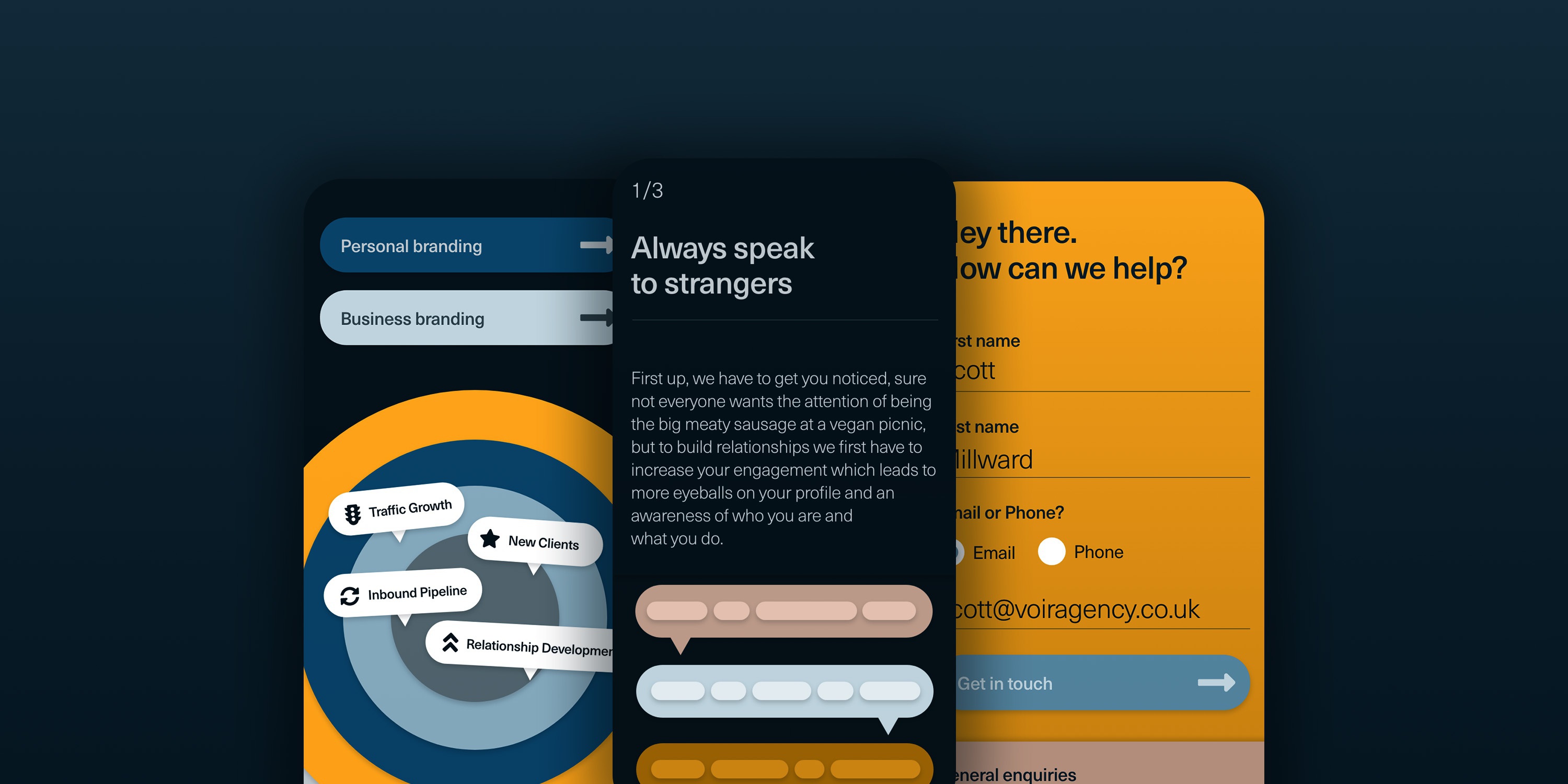
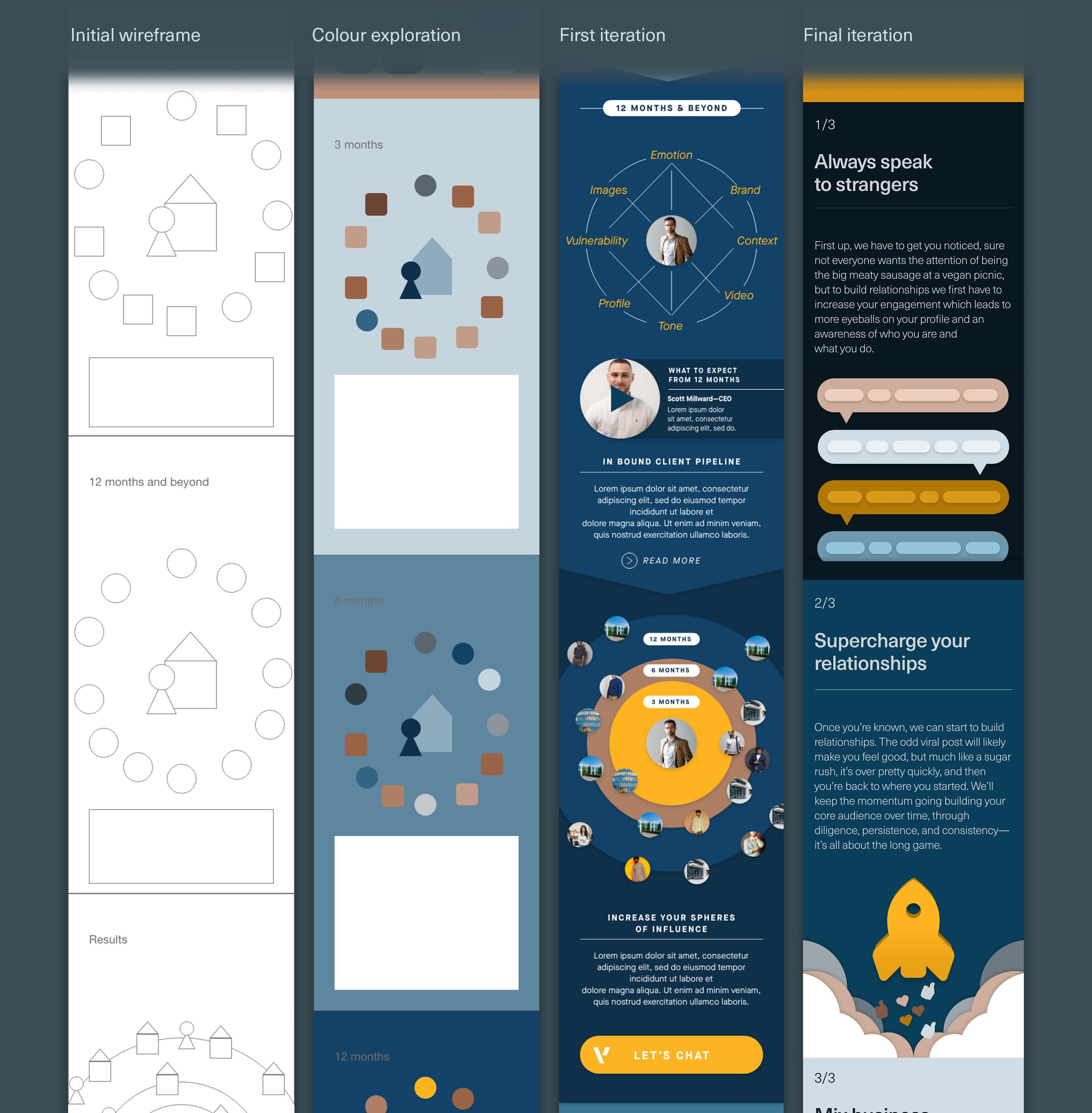
The primary palette consists of unctuous blues, glorious rose golds, and sumptuous yellows. The website’s user journey progresses in colour gradations to provide a sense of movement for the visitor, as if you’re achieving something simply by reading. We used yellow to denote success, results, and endpoints, or areas where user interaction can take place. We employed rose gold to signpost alternatives and recommendations. We used block colours and subtle gradients, carefully placed drop shadows and full-colour animations, all in an effort to create an experience worth spending some time with.
Given this is a new industry, we knew we needed to define clearly and simply Voir’s service proposition. For example, with the homepage of the website, we created a simple yet informative user journey that methodically outlines Voir’s process.
It also serves the purpose of putting off the wrong kind of client. Want somebody to pump the numbers? Look elsewhere. Want somebody to promise you the moon and never deliver? Look elsewhere. Don’t want to pay for a quality service? Look elsewhere.
In choosing a primary typeface, we knew it needed to project modernism and simplicity, but also professionalism and sophistication, as well as work well in both digital and print settings.
We trialled over 150 typefaces before landing on the ever so resplendent Neue Haas Unica. The story behind this typeface is a whole thesis in its own right. Briefly, it was invented to bring the classics, such as Helvetica and Univers, into the modern age, with a fresh and evocative digital finish. It was created by a stellar triptych of typographers who have considerable respect for the history of their craft, but were itching to add newness and imagination of their own. It’s a story of transformation.
Branding is as much about how something sounds and feels as how it looks.
Nothing could have been more perfect for Voir.
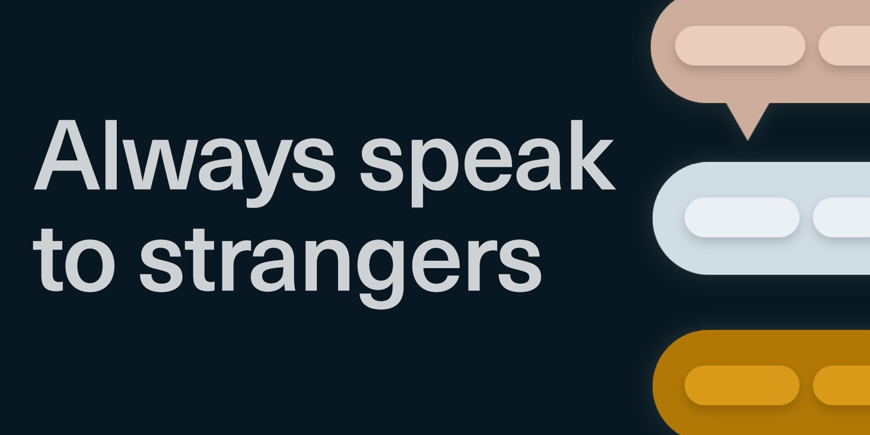

We complemented the colour palette and typography with an array of bespoke graphics that are perfect in static, but really come into their own when animated. They further signpost Voir’s process and its brand values, but also bring a level of fun and dynamism to the digital aspects of the brand. Subtle line rules, modern iconography, and a complete range of micro-interactions dotted throughout the user interface, round out a brand kit that sings when it needs to, but moves out of the way when it doesn’t.
Beyond visuals, we looked at tone—branding is as much about how something sounds and feels as how it looks.
With Scott’s help, we created a tone of voice for Voir that is not overbearing like that employed by its peers. It doesn’t talk about itself, which is the irony of so many marketing firms. Instead, like the visual aspects of the branding, it’s user-centred, and even pokes fun at itself in places, providing the necessary level of humour you get from working with Voir. It feels grounded, self-aware, and demonstrative of a deep love for craft.
Ultimately, the tone of voice is about attracting the kinds of clients that Scott wants to work with, on a level that simply doesn’t exist yet in this industry. All in all, it’s a premium brand identity for a premium personal branding agency.
And we’re only just getting started…
Branding that converts prospects into clients
What we learnt from working on this project is that there are two types of purveyors of personal branding.
There are those that give all their time to the numbers, to pushing out content, and to buying into the notion that likes, shares, and views are a form of social currency.
And then there’s Scott. He sees the value in the numbers, but he knows they’re the conduit, not the endgame.
Yes, he’s a marketer. Yes, Voir is a marketing agency. But both are treading a path to maturity, not vanity metrics. It’s a pleasure to behold.
This project has been—and continues to be—a true labour of love for our team at Umlaut. It is humbling to see real-world changes to how Scott does business as a direct result from the branding we have created.
Comments on the visual identity centre around credibility, direction, and one that isn’t scared of speaking a whole new language, even if that means zigging while others zag.
For a new company in a new industry, this speed of progression is practically unheard of. We couldn’t be happier to have helped make that happen.
And, what’s probably most interesting is that Voir is yet another example of a client who came to us specifically because we share the same outlook of being just left-of-centre enough to bring something fresh to the world.
You could say it was a perfect match.
More articles
-
Great design is heard, not just seen
Music: it's the best invention ever. And it goes hand-in-hand with creativity. At Umlaut, we prize music above all else. It makes us better designers. Here's why.
Design
-

Great branding makes great business
Beyond just having a memorable logo, strong branding raises a company's value, gives staff purpose and motivation, and makes attracting new clients easier. But exactly what is a brand? The quick answer is - it's everything.
Design
-

Procrastination, uncrastination, and a fireball of catastrophe
Our Creative Director, Ryan, reveals an observation about his work practices that leads to a situation he never expected.
Design
-

How to make brand guidelines for your business
Here’s how to make a brand book that lays out the look and feel of your business.
Design
-

Creating branding for Frida Rome worthy of Dragon’s Den investment
Helping mates realise their dreams is one of our proudest moments.
Design
-
Manchester's creative resurgence
Manchester is growing up, people – and it's about time we acknowledged it!
Design
-

-

Your complete guide to rebranding in 2022
Rebranding is a nightmare, right? It's a sign of a failing company, right? Wrong. Here's how to approach rebranding the right way.
Design
-

A history of modern design - from Bauhaus to Dieter Rams
We're called Umlaut. It's a German word. More specifically, it's a German typographic word. Even more specifically, it’s those two dots that go above certain vowels. That wasn't by accident.
Design
Let's work together.
Get in touch
Find out more about us
