A history of modern design — from Bauhaus to Dieter Rams
Design
Alex MacDonald
The Bauhaus was an idea. Only an idea has the power to disseminate itself so widely.
— Mies van der Rohe, Third and Last Director of the Bauhaus
We're called Umlaut. It's a German word. More specifically, it's a German typographic word. Even more specifically, it’s those two dots that go above certain vowels. That wasn't by accident. We have big love for the German designers who basically invented our craft and how their work and ideas still shape design today.

Bauhaus design’s impact on today’s graphics is hard to overestimate. Associated with primary colours, thick straight lines slashing across white space, and that emphatically modern trilogy of the circle, triangle and square, the movement’s legacy is not lost on us here at Umlaut.
Bauhaus as a school of thought
The Bauhaus was not just a physical college, it manifested into a school of thought that was synonymous with the free-spirited, the avant-garde. Women at Bauhaus wore cropped hair and were permitted into metal workshops. People wrote in low caps.
There was a sense of play in everything they did at the Bauhaus – which is very clear in the photographs of the Bauhaus parties, which became so popular that they were even written about in the press actively. There was lightness amongst the teachers and students. All symbolising a departure from traditional views of manner and etiquette as well.
We should point out that there were objectively some fairly hard left underpinnings at the school. Its broad outlook was that the working classes would channel craftsmanship, art and architecture to collectively improve their environment.
Bauhaus was about design for everyone, which didn’t sit brilliantly with the Nazis, who considered it to be “degenerate” and rooted in “Bolshevism”. Ultimately, though, there was a real non-elitist philosophy of inclusion and creative freedom, two things we value immensely at Umlaut.
Bauhaus, with its innovative beliefs and liberal ideology, soon became a victim of its success. By the 1930s, the art school had captured the attention of the Nazis and was shuttered. Its founders, fearing retribution, fled first to the UK, and then on to the US.
Despite this, Bauhaus—and its principles—lived on and has shaped the approach of artists, manufacturers (and even singers), such as Dieter Rams (we’ll get onto him later), Frank Lloyd-Wright, Jonny Ive, and yes, even Kanye West.
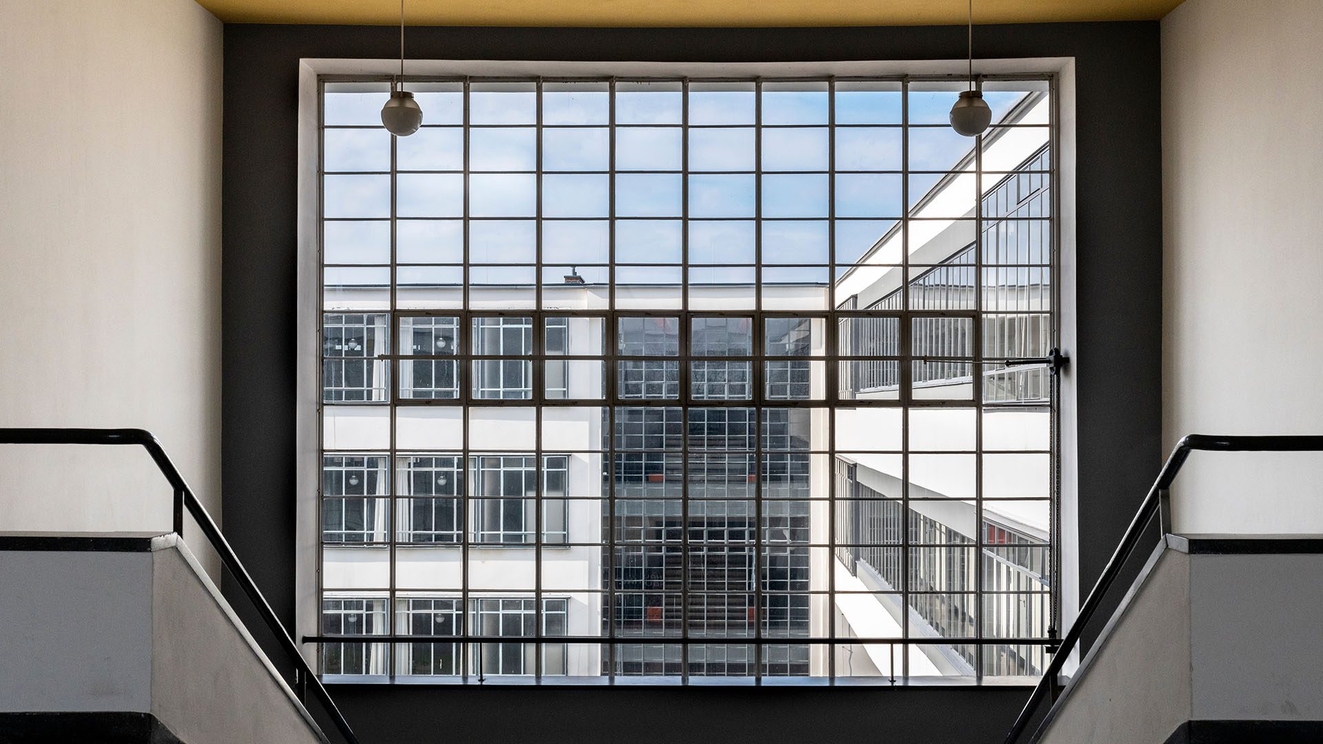
Bauhaus every week…day
The Bauhaus has influenced everything, from graphic design to furniture. With its emphasis on function over form, Bauhaus, the pioneers of the minimalism movement, which remains one of the most prominent styles to this day, assisted the design community in moving away from the elaborate creations of the early 20th century.
We can also see Bauhaus influences in other popular forms, such as Scandinavian, industrial, and mid-century modern, showing how widely the school's ideas have been adopted. This influence has permeated the design world so thoroughly that designs that were previously unique and spectacular are now so commonplace that we might miss them if we don't stop and take a closer look.
Every type of modern design that we use today—minimalism, industrial design, Scandi, maximalism, brutalism—all descended from the Bauhaus movement, much like every type of electronic music evolved from disco.
The Bauhaus school gave rise to what is now known as the classic modern aesthetic, which has since entered every field of the arts, including textiles, fashion, interior design, and graphic design. One of the main tenets of the school was that the connection between the teacher and the student was a collaborative one and that at the end of the day, it was all about achieving a shared objective.
Ich bin ein Berliner
From industrial to graphic design, Germany's diverse creative culture is both forward-thinking and mindful of the nation's rich heritage. Perhaps the multifaceted legacy of Bauhaus best captures the diversity of design in Germany.
You must either integrate it into your work as a designer or cope with it. There is no getting around the fact that you need to have a mindset when it comes to the Bauhaus. You are taught to design honestly and to concentrate on the essentials from the very beginning.
The capital of Berlin remains to this day, a shining beacon of bohemian freedom and liberalism (individual rights, equality etc.). This translates beautifully through its industrial design – the country’s most famous export. Germany also has a strong history of graphic design, with a proliferation after the industrial revolution in the 18th century.
It’s a history that has inevitably darker stretches — during the Nazi occupation, graphic design, under the hateful eye of Joseph Goebbels as Reichsminister of Public Enlightenment (if you say so…) and Propaganda, was used as a propaganda tool and some of the country’s designers produced work for the state. Ludwig Hohlwein, for example, worked for automobile companies like Audi before collaborating with Goebbels on Nazi propaganda.
The ADGB Trade Union School, a zigzagging complex of brick, steel, and glass surrounded by woodlands and the autobahn, is just one example of the abundance of Bauhaus architecture in Berlin. You can take a tour of Berlin's most well-known Bauhaus structures to observe how they impacted the city's overall design.
How did Bauhaus foster Graphic Design?
The minimalist design aesthetic of the Bauhaus helped lay the groundwork for contemporary graphic design since the artists there were so receptive to new media and methods of creating art. Modern graphic design ideas, colour theory, and the usage of typeface design were all impacted by Bauhaus.
Digitalised Bauhaus Typefaces
The development of new typefaces with additional adornment that make them usable and accessible for usage in a variety of print media and signage was greatly influenced by the Bauhaus movement. Some of these fonts were merely prototypes that were never released. Many graphic designers have digitalised these fonts in the modern era. For instance, Flavia Zimbardi redesigned the Joschmi typeface after being influenced by Bauhaus typographer Joost Schmidt.
Geometric Shapes
Because of their emphasis on geometry and shape psychology, we can clearly understand the usage of geometric forms in some Bauhaus poster designs. This attention to the study of shapes has inspired contemporary graphic design and encouraged a more minimalist aesthetic that places a greater emphasis on shapes and their underlying symbolic meanings, resulting in more aesthetically pleasing design layouts. The revolutionary methods used by the Bauhaus artists and their emphasis on the purpose of graphic elements made them way beyond their time.
Total Design
You may have heard of the ‘total football’ of the Netherlands, but what about the ‘total design’ of Germany? Bauhaus teachings were concerned with giving practical craft skills such as interior design, architecture, textiles, and woodwork the same sort of status as fine art. It also saw technology as a great enabler.
A fundamental element of the core curriculum and a place for students to start was design and colour theory, materials, and method. In the concept of "total" art or design, the Bauhaus design principles were easily applied to any sort of design within the school, often in unison. We also embrace this harmonious marriage of tech and human creativity, using them to complement and enhance each other, rather than detract.
The OGs of Graphic Design
While Walter Gropius might have been the guy who pioneered the Bauhaus, Joost Schmidt produced what is probably the single most recognised Bauhaus image for a Bauhaus exhibition in 1923 when still a student. It incorporated the Bauhaus logo created by Oskar Schlemmer in 1922 and displayed functional hallmarks but was also highly experimental and eye-catching.
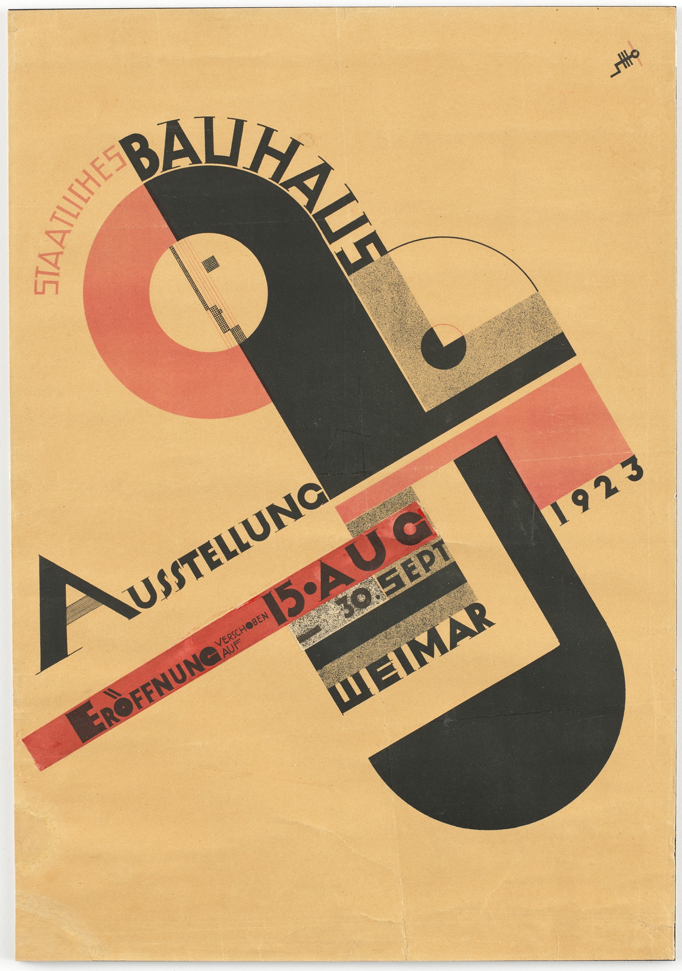
Source: MOMA
Schlemmer’s logo depicts a figure, or a face, which is deliberately ubiquitous, impassive and generic. His work frequently featured figures that combined a geometrical and human quality. Ballet, opera, and theatre were among the things that interested Schlemmer. This meant that he engaged in three-dimensional (3D) design work and teaching. His Triadisches Ballett, in which Schlemmer designed all the elements—including the posters, costumes, music, and lighting—famously captured these disciplines.
Enter Dieter Rams in 1955, today regarded as the godfather of design, who joined Braun, one of the first German consumer goods corporations. He transformed the field of industrial design. His innovations were revolutionary at the time and changed our perceptions of what things should look like and how they should function. All of them still feel modern now.
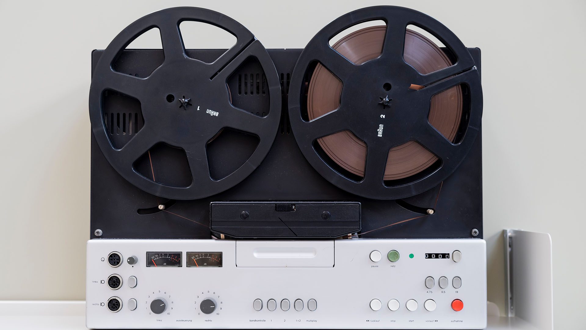
Even though they were created ages ago, they are still regarded as contemporary works of industrial design. Take a look at the typographically similar and timeless logos of Braun and the Bauhaus. Consider the early Braun Atelier 1 radio made of white metal and wood, as well as the TG1000 reel-to-reel tape recorder, both of which were created by Dieter Rams.
Each of these qualities originated in the Bauhaus and was repurposed for a new era using geometric shapes, a lack of excess, and an obviousness of use that was so minimal as to hardly be designed at all. The use of geometric and simple shapes in design remains extremely popular today. Rams’ famous maxim, “less, but better” could not ring truer as a mantra for the design team at Umlaut.
From the Braun tabletop radio to the Oral-B toothbrush, Rams' designs are still in use today not just in Germany but also all over the world. His legacy of simple, timeless design has long been regarded as the gold standard in design. For instance, the Rams-designed LE Braun speaker was updated and reintroduced just a few years ago.
The Apple doesn’t fall far from the tree
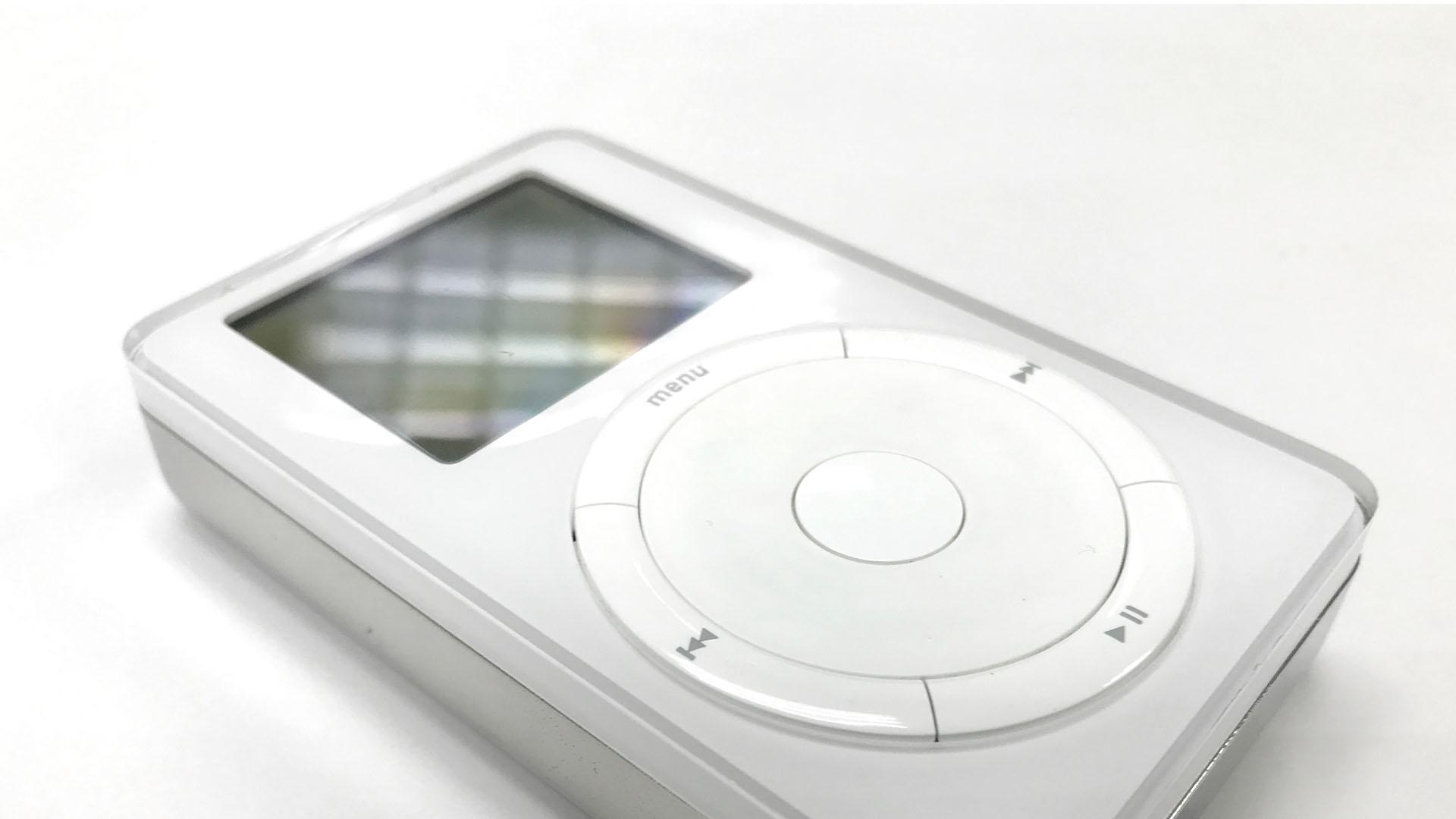
Push forward again to the next decade and we reach Jonny Ive, the ex-Chief Design Officer at Apple. After striking up a relationship with CEO Steve Jobs, he set to work revolutionising what computers looked like and how they worked.

This led to the invention of the smartphone. Its current form—that buttonless sheet of glass—is a modern reinterpretation of Dieter Rams’s work at Braun (the click-wheel, the calculator app, and the very shape of the iPhone itself, all take influence from Rams’s work).
Steve Jobs had many enduring quotes, but one, “Design isn’t just how something looks, it’s how it works,” is “Form follows function” for a new era.
There’s a direct line between the theorists of the Bauhaus in 1920 and Apple—a company many consider the epitome of good design—more than 100 years later.
Why we live and breathe Bauhaus
The influence of Bauhaus was profound. They had an impact on everything, from the tallest buildings in America to fonts to black, white, and grey colour schemes with a single red or yellow wall. How would any American metropolis feel without its imposing steel and glass skyscrapers? Can you even envision a house entirely made up of antiques?
From design studios to tech start-ups, the disruptors of the corpocracies of today, are the children of the prototypical Bauhaus school. At Umlaut, we are first and foremost artists, and at the same time, if innovation comes along, we use it. The two aren’t mutually exclusive, in fact, quite the opposite.
On the one hand, it's shocking that despite our best efforts to reinvent ourselves, we've never been able to come up with a fresh vision of what new looks like or how it functions. Bauhaus still prevails with its eternal philosophy and set of principles for design, and for life.
You could say that design in its current form continues because it is simply how things ought to be, given that Bauhaus ideals have persisted for so long practically unchanged—much like mathematics or science. Why fix it if it isn’t broken – and if Bauhaus is one thing, it certainly isn’t broken.
Our modern lives are changed by the objects we have around us whether by choice or by chance, by design or determinism. Because of what our shiny precious totems can do for us and how they influence our lives, we believe that we are different from the generations that came before us.
And yet, without the Bauhaus movement, none of what we have now would be imaginable. Everything we have today is thanks to the idea that, with enough thought, anything can be both beautiful and useful. So yeah, that’s why we called ourselves Umlaut…
More articles
-

-

Great design is heard, not just seen
Music: it's the best invention ever. And it goes hand-in-hand with creativity. At Umlaut, we prize music above all else. It makes us better designers. Here's why.
Design
-

Creating a timeless brand identity in an industry that's only just getting started
Read our in-depth analysis on our recent brand identity project with Voir.
Design
-

Procrastination, uncrastination, and a fireball of catastrophe
Our Creative Director, Ryan, reveals an observation about his work practices that leads to a situation he never expected.
Design
-

Great branding makes great business
Beyond just having a memorable logo, strong branding raises a company's value, gives staff purpose and motivation, and makes attracting new clients easier. But exactly what is a brand? The quick answer is - it's everything.
Design
-

Creating branding for Frida Rome worthy of Dragon’s Den investment
Helping mates realise their dreams is one of our proudest moments.
Design
-

Your complete guide to rebranding in 2022
Rebranding is a nightmare, right? It's a sign of a failing company, right? Wrong. Here's how to approach rebranding the right way.
Design
-
How to make brand guidelines for your business
Here’s how to make a brand book that lays out the look and feel of your business.
Design
-
Manchester's creative resurgence
Manchester is growing up, people – and it's about time we acknowledged it!
Design
Let's work together.
Get in touch
Find out more about us