
Creating branding for Frida Rome worthy of Dragon’s Den investment
Case Study
Ryan Taylor
Last night on Dragon’s Den, two of my close friends secured investment from Steven Bartlett for a share in their vegan fashion brand, Frida Rome. To say I am proud of them would be a colossal understatement. We had a small part to play in the company’s journey by creating the brand ident for Frida Rome, but that is a mere footnote in the journey they are about to embark on. It’s not often you get to support your friends like this, so bear with me while I stan, it’s a story worth hearing.
I first met Rebecca Joy in Ancoats, at a co-working space we both worked from at the time. There was something about her that immediately drew me in. Maybe it was her height, as she stood statuesque above us all. Maybe it was her faux fur coat, resplendent in all its drama and intrigue—totally inappropriate for a work environment—and yet, somehow, effortlessly perfect. Or maybe, just maybe, it was her uncanny ability to suss you up in a single glance.
I don’t remember the specific words of our first conversation, but what I do remember is she made an observation about me that was so profound, so immediately revelatory, that I just had to know more.
Rebecca went on to showcase her inner-beauty on countless occasions. When I was going through a particularly rough patch personally, she took me in, just weeks into our friendship, by offering me a room in her home. No questions asked, just like that.
I first met Natalia Deana at the same co-working space. She was living in Australia at the time, and had flown over to visit Rebecca. She was wild; in fact, that barely scratches the surface. When she moved back permanently, she also ricocheted into my life, totally unexpectedly, bouncing off the walls, tearing up the status quo, and bringing her unequivocal charm and exuberance to the party.
We’ve since spent much time together. Their effervescence is infectious, and they’ve taught me how to be less wrapped up in, well, everything—a crash course in living a little, you could say.
Rebecca and Natalia are the formidable force you saw on your screens last night.
As you get older, you don’t get that many chances to make new friends. When these two burst into my life, with all their free-spirited abandon, I felt a great sense of privilege, and truly, like I’d finally found my people.
It is was a no-brainer then, when they asked us to create an ident for what was, at the time, a fledgling vegan bag company. We jumped at the chance.
I’ll be honest, to a team made up primarily of Yorkshire lads, handbags were not exactly in our wheelhouse, but, that made the challenge all the more interesting. The brief was straightforward: create a statement, make a nod to a certain type of lifestyle, and make it current. As we all know though, straightforward and simple are not the same thing.
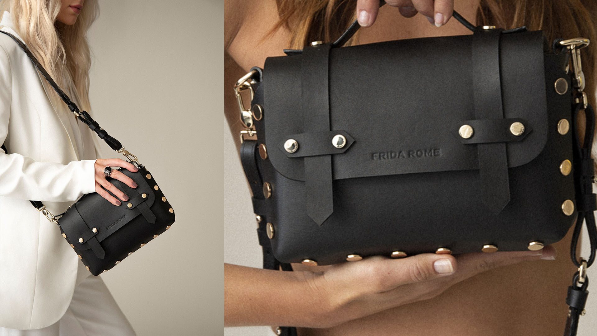
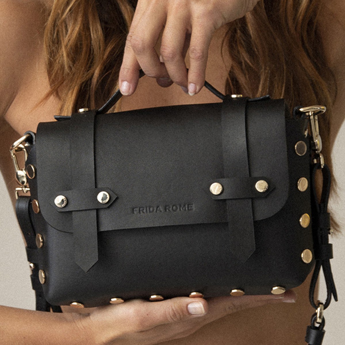
The idents of most fashion houses focus heavily on logotypes—logos made of words—and we wanted to follow that motif but without mimicking; nobody likes a parody. A strong typeface was our first port of call. After many deliberations, we settled on Termina Bold. It’s angular construction and stalwart appearance made for a perfect starting point towards that statement piece the ladies were looking for, but despite this, there was something not quite sitting right. We decided to roll our sleeves up and recreate the mark in a custom variation of the font.
We extended the last E in Rome to give it a more deliberate feeling, to balance the left and right, and to square off the logo as a whole. We hollowed out the O to give it more breathing space. We deliberately spaced the letters wider than would be considered appropriate for reading, which gave the wording gravitas, making it feel less like typed words on a page and more like a logo. Finally, we stretched the entire piece out, and contracted its height, giving it a pronounced appearance leant it weight, strength, and purpose.
Now we had an anchor, the rest followed fairly easily. An assortment of colour palettes were pulled together, as well as a number of mock materials featuring core elements of the brand—women, lifestyle, enjoyment, fulfilment, and panache.
The result is an ident that feels solid to the touch, and perfectly suited to the visual life we all live these days, as well as being the statement the ladies were looking for. The logo now adorns all the products the company makes, and has garnered much appreciation from Frida Rome’s ever-expanding following.
But enough of that. More importantly, is the success of these wonderful women, women that I proudly get to call my friends. I watch in awe as I witness was they have achieved. I see their efforts, their passion, and their verve for life, and it excites me, and humbles me. They threw their whole selves into something, and came out on top. I’ve never been prouder of them. I’ve never felt more connected to a project. And I have no doubt in my mind, that this is only the beginning.
Sometimes, it really does work out.
You can find out more about Frida Rome by visiting their website here.
Related projects
More articles
-
Procrastination, uncrastination, and a fireball of catastrophe
Our Creative Director, Ryan, reveals an observation about his work practices that leads to a situation he never expected.
Design
-
Manchester's creative resurgence
Manchester is growing up, people – and it's about time we acknowledged it!
Design
-
A history of modern design - from Bauhaus to Dieter Rams
We're called Umlaut. It's a German word. More specifically, it's a German typographic word. Even more specifically, it’s those two dots that go above certain vowels. That wasn't by accident.
Design
-

Great branding makes great business
Beyond just having a memorable logo, strong branding raises a company's value, gives staff purpose and motivation, and makes attracting new clients easier. But exactly what is a brand? The quick answer is - it's everything.
Design
-

Creating a timeless brand identity in an industry that's only just getting started
Read our in-depth analysis on our recent brand identity project with Voir.
Design
-
Your complete guide to rebranding in 2022
Rebranding is a nightmare, right? It's a sign of a failing company, right? Wrong. Here's how to approach rebranding the right way.
Design
-
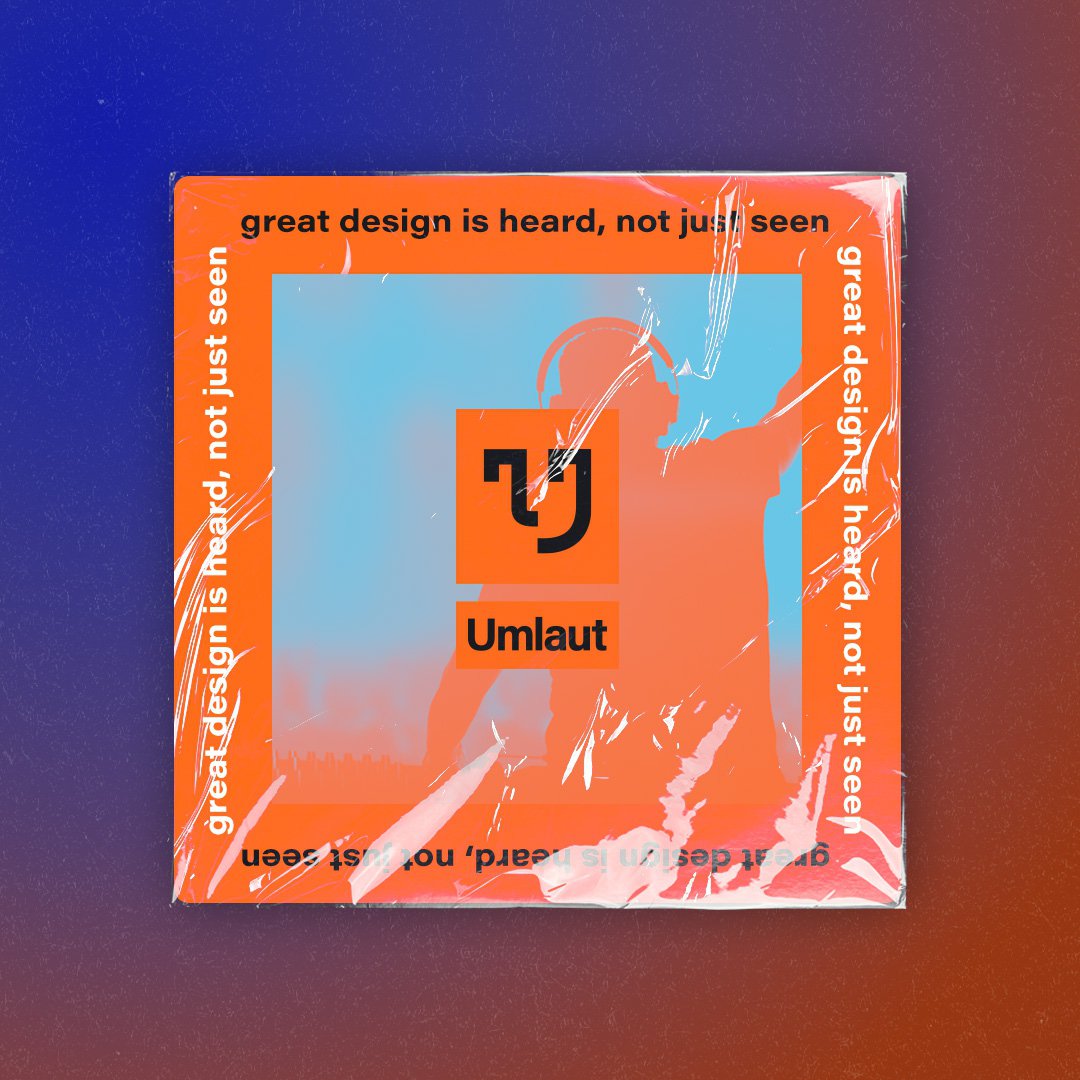
Great design is heard, not just seen
Music: it's the best invention ever. And it goes hand-in-hand with creativity. At Umlaut, we prize music above all else. It makes us better designers. Here's why.
Design
-
-
How to make brand guidelines for your business
Here’s how to make a brand book that lays out the look and feel of your business.
Design
Let's work together.
Get in touch
Find out more about us