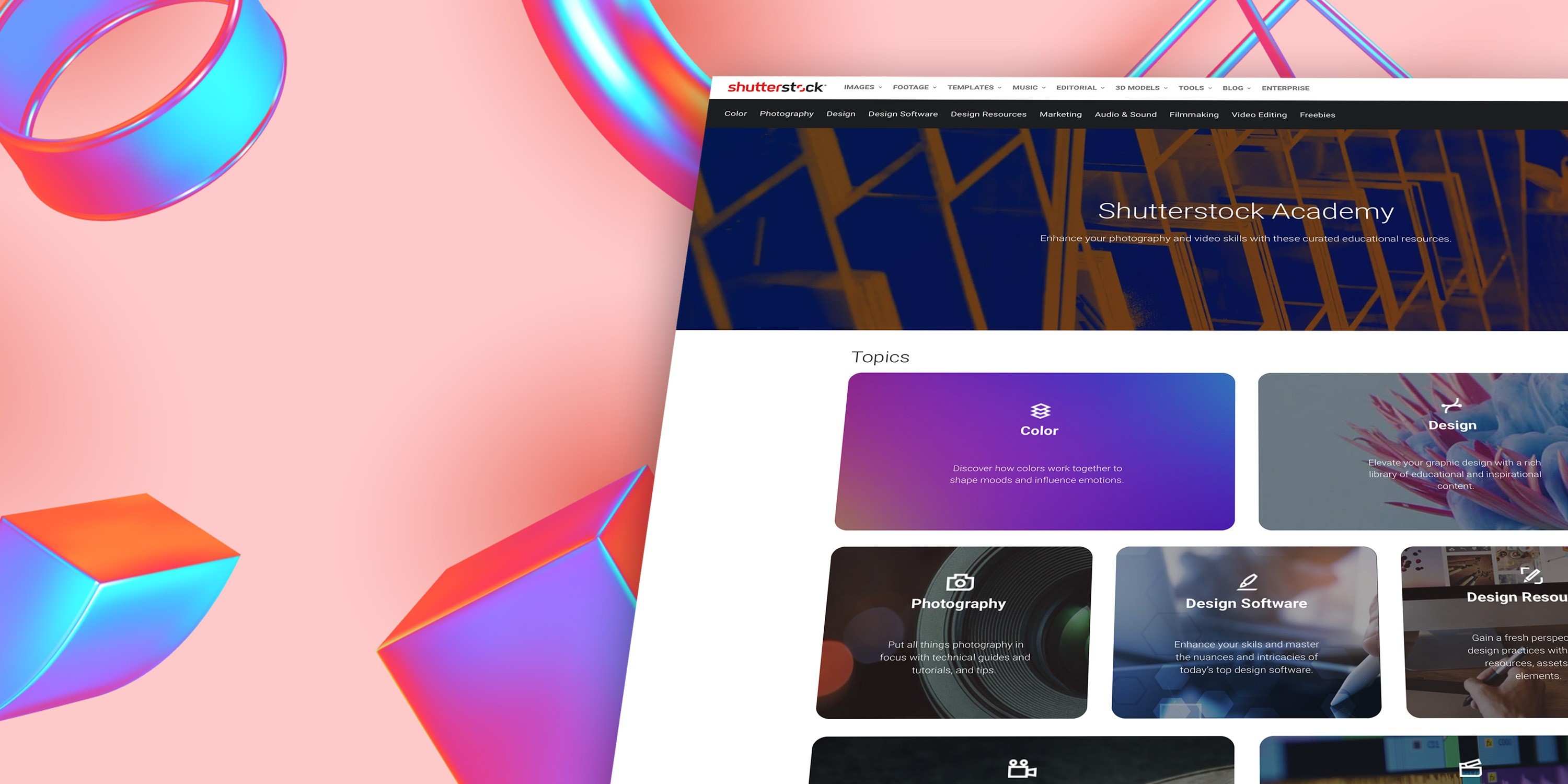
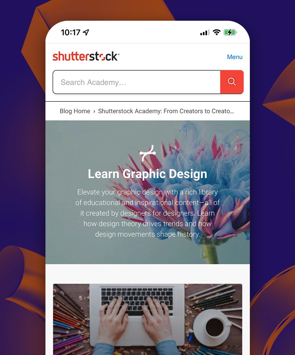
A new user experience for Shutterstock's Academy of creative learning.
Shutterstock


Shutterstock — the global stock photography, illustration, and video provider — approached us to help them expand their services by designing the Shutterstock Academy website. The current blog back catalogue at Shutterstock is vast, so our job was to devise a way that these articles could be meaningfully chunked together into a series of lessons on a given subject. For example, if somebody wanted to know more about ‘How to use Photoshop’, they could search for those terms, and be presented with a logical order of blog articles presented as a course.
Shutterstock’s brand identity is well-established, so our job was to devise the structure of the Academy to ensure maximum usability and discovery, and to apply the current brand guidelines so that the Academy fitted seamlessly into the overall Shutterstock website and brand.
The result was a brand new Shutterstock Academy section of the website, that has increased ease-of-use, allowed readers to take a more streamlined approach to their learning, and has helped Shutterstock resurface neglected articles from the back catalogue. All of these results have meant increased traffic for Shutterstock and value added for the reader, for very little effort.
Let's work together.
Get in touch
Find out more about us
